Grids in CSS


CSS Grid Layout is a two-dimensional layout system for the web.
It lets you lay content out in rows and columns. It has many features that make building complex layouts straightforward
What is grid layout?
To define a grid we use the
gridvalue of thedisplayproperty. As with Flexbox, this enables Grid Layout; all of the direct children of the container become grid items.Unlike flexbox, the items will not immediately look any different. Declaring
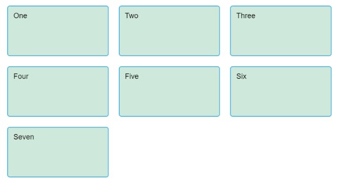
display: gridgives you a one column grid, so your items will continue to display one below the other as they do in normal flow.To see something that looks more grid-like, we'll need to add some columns to the grid. Let's add three 200-pixel columns. You can use any length unit or percentage to create these column tracks
.container {
    display: grid;
    grid-template-columns: 200px 200px 200px;
}
Flexible grids with the fr unit
- we can use the fr unit to flexibly size grid rows and columns. This unit represents one fraction of the available space in the grid container.
.container {
    display: grid;
    grid-template-columns: 1fr 1fr 1fr;
}
- The
frunit distributes space proportionally. So if you specify different positive values for your tracks like so:
.container {
    display: grid;
    grid-template-columns: 2fr 1fr 1fr;
}
Gaps between tracks
- To create gaps between tracks we use the properties
column-gapfor gaps between columns,row-gapfor gaps between rows, andgapas a shorthand for both.
.container {
    display: grid;
    grid-template-columns: 2fr 1fr 1fr;
    gap: 20px;
}
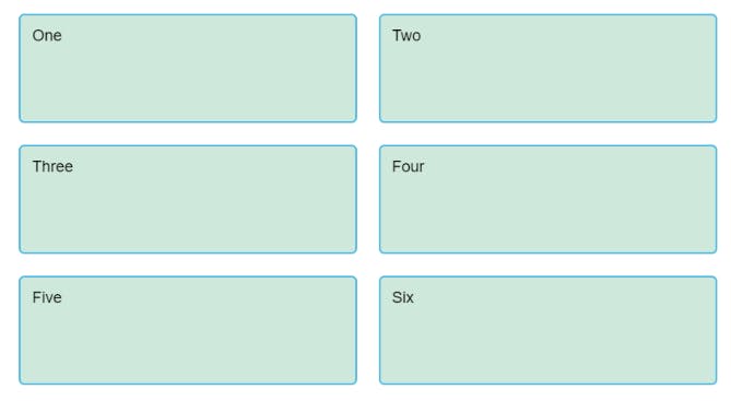
Repeating track listings
- The first value passed to the
repeatfunction specifies the number of times you want the listing to repeat, while the second value is a track listing, which may be one or more tracks that you want to repeat.
.container {
    display: grid;
    grid-template-columns: repeat(3, 1fr);
    gap: 20px;
}
The implicit and explicit grid
The explicit grid is the one that you create using grid-template-columns or grid-template-rows.
The implicit grid is created when content is placed outside of that grid, such as into our rows.
By default, tracks created in the implicit grid are auto sized, which in general means that they're large enough to accomodate their content.
If you wish to give implicit grid tracks a size, you can use the grid-auto-rows and grid-auto-columns properties.
If you add grid-auto-rows with a value of 100px to your CSS, you'll see that those created rows are now 100 pixels tall
.container {
  display: grid;
  grid-template-columns: repeat(3, 1fr);
  grid-auto-rows: 100px;
  grid-gap: 20px;
}
The minmax() function
.container {
  display: grid;
  grid-template-columns: repeat(3, 1fr);
  grid-auto-rows: minmax(100px, auto);
  gap: 20px;
}
The minmax() function lets us set a minimum and maximum size for a track, for example, minmax(100px, auto).
The minimum size is 100 pixels, but the maximum is auto, which will expand to accomodate more content.
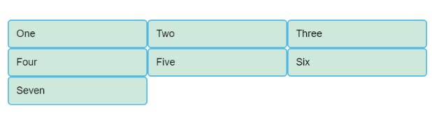
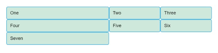
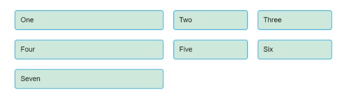
As many columns as will fit
.container {
  display: grid;
  grid-template-columns: repeat(auto-fill, minmax(200px, 1fr));
  grid-auto-rows: minmax(100px, auto);
  gap: 20px;
}
This works because grid is creating as many 200 pixel columns as will fit into the container, then sharing whatever space is leftover among all the columns.
The maximum is 1fr which, as we already know, distributes space evenly between tracks.
Line-based placement
- We now move on from creating a grid to placing things on the grid. Our grid always has lines. These lines are numbered, beginning with 1.
They relate to the Writing Mode of the document. Therefore, in English column line 1 is on the left hand side of the grid and row line 1 at the top.
We can arrange things in accordance with these lines by specifying the start and end line. We do this using the following properties:
1) grid-column-start

2) grid-column-end

3) grid-row-start

4) grid-row-end
These properties can all have a line number as their value. You can also use the shorthand properties:
   1) grid-column

   2) grid-row
These let you specify the start and end lines at once, separated by a forward slash /.
output
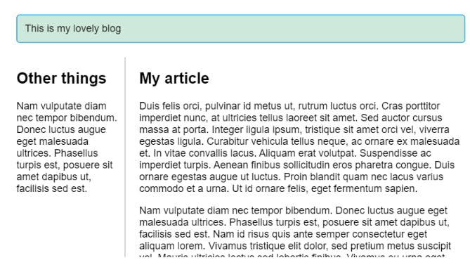
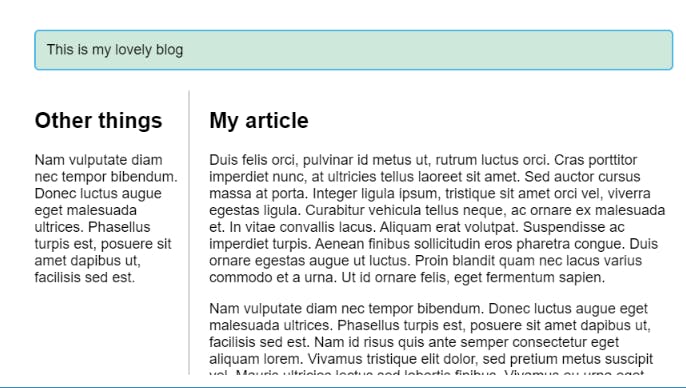
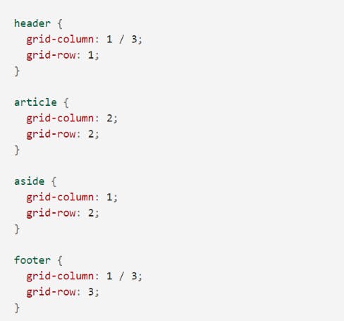
Positioning with grid-template-areas
An alternative way to arrange items on your grid is to use the grid-template-areas property and give the various elements of your design a name.
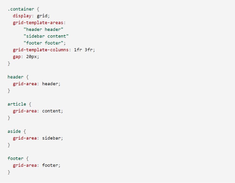
The rules for grid-template-areas are as follows:
You need to have every cell of the grid filled.
To span across two cells, repeat the name.
To leave a cell empty, use a . (period).
Areas must be rectangular — you can’t have an L-shaped area for example.
Areas can't be repeated in different locations.
output